Oops! This case study isn't available in mobile portrait view.
Try turning your phone to landscape mode!

- This was my senior thesis project.
- It took 100+ hours over the course of 6 weeks.
- Grace College Students, Ages 18-25
- I planned, researched, and executed every part of the project.
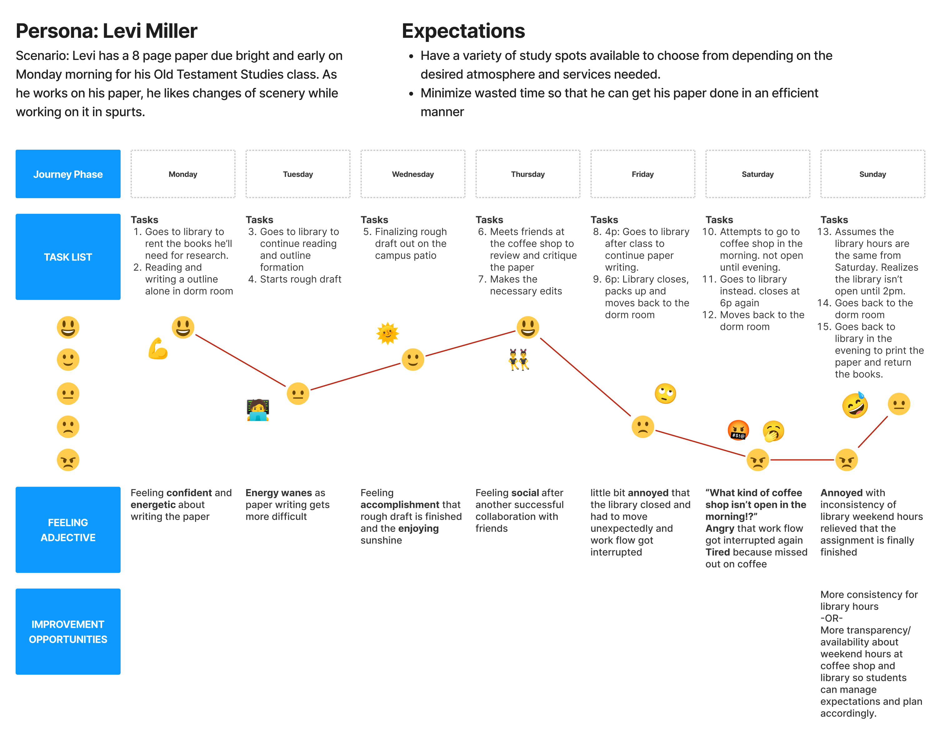
- As a busy seminary student, I want a variety of study spots on campus to write my paper and to be able to print my 8 page paper, so that I can turn it in to my professor on Monday morning.
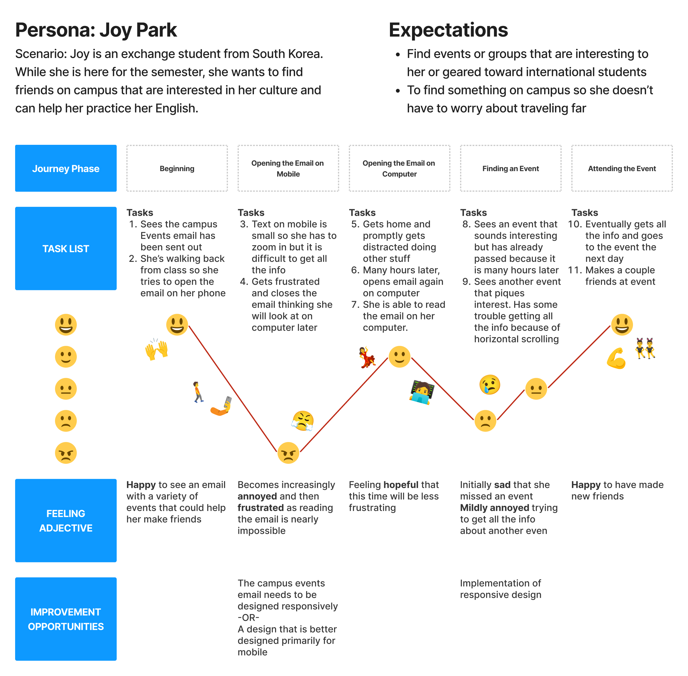
- As a lonely Korean exchange student, I want to learn about fun events on campus, so that, I can meet other students and make a few friends.
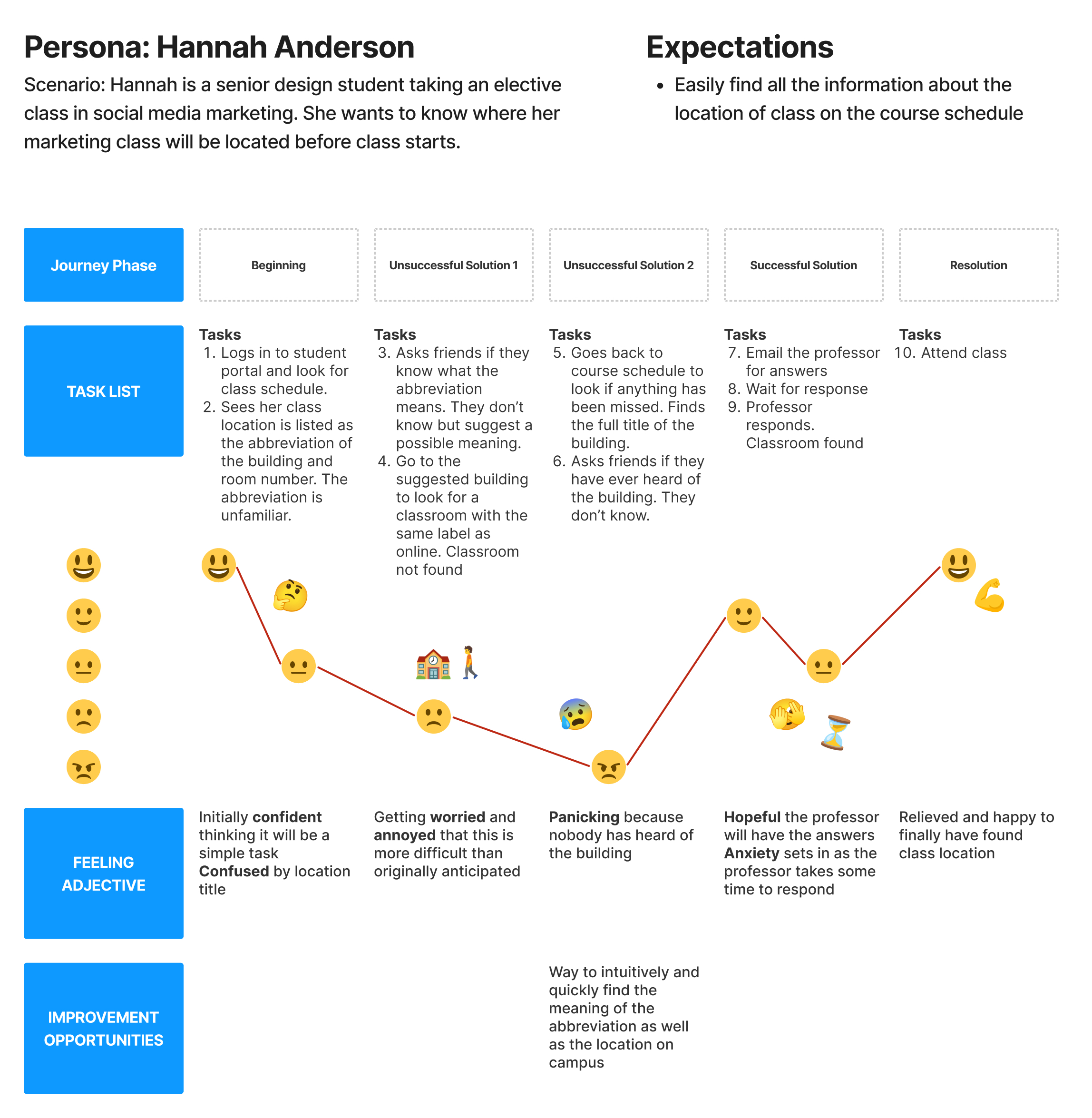
- As a senior design student at Grace College, I want to know where my classes are before the semester starts, so that I can show up to class on time and make a good first impression with my professor.
- As a busy professor, I want to minimize time spent answering emails, so that I can spend my time doing research and academics.
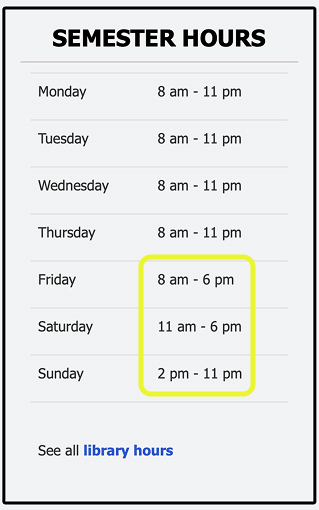
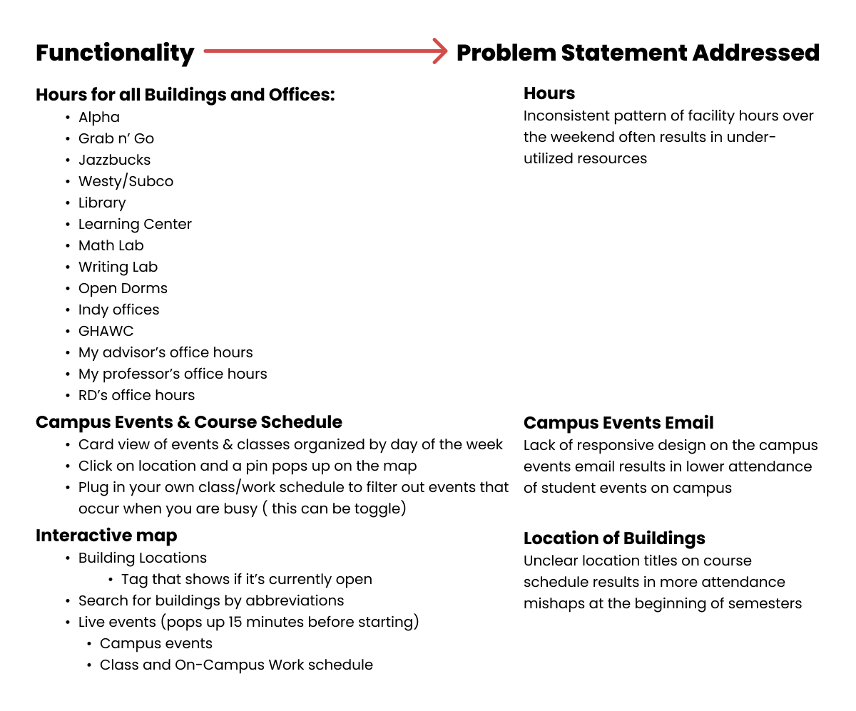
On campus, there are over 30 different buildings and offices that students regularly need access to. The hours for these places differ. Some of the hours have a familiar, easy-to-remember pattern like Mon-Fri 9a-5p. Other places, like the library, have different hours every single day of the weekend, with no recognizable pattern. This is a problem because students are likely to forget that the building is not open during the a certain times over the weekend and attempt to go only to be met with a locket door. This is an avoidable roadblock that unnecessarily increases stress and frustration when completing time sensitive deadlines. Additionally, the college ends up wasting money on under utilized resources and staffing costs when students stop trying to use the library over the weekend.
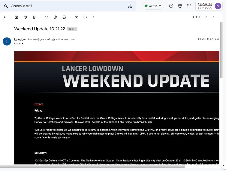
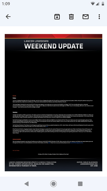
Twice a week, students get an email detailing various campus-wide extracurricular, fun, and sporting events. Unfortunately, this email does not feature responsive design, so depending on your device, the email ranges from mildly annoying to read to completely illegible on small mobile devices. This is a problem because students have a harder time reading the email and may miss out on social events that may have been interesting. Additionally, those people running the events have less of an opportunity to get good engagement and outcomes at their event.
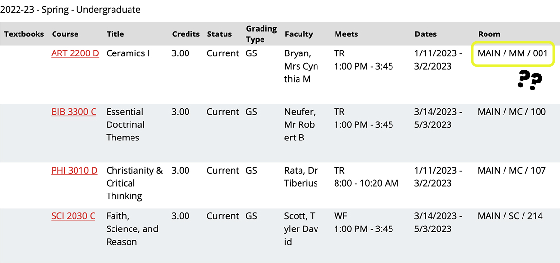
When a student views their courses on the student portal, the location is only listed as the building’s abbreviation and the room number. If a student is not already familiar with the building’s abbreviation and physical location, they don’t have an easy way to find out where their class is. This is a problem because it adds unnecessary stress, frustration, and anxiety to a student’s life. Students may accidently show up to the wrong building on the day of class and not know where to go or eventually show up late to class. Additionally, professors have to take extra time out of their busy days answering a multitude of student emails with directions to their class.
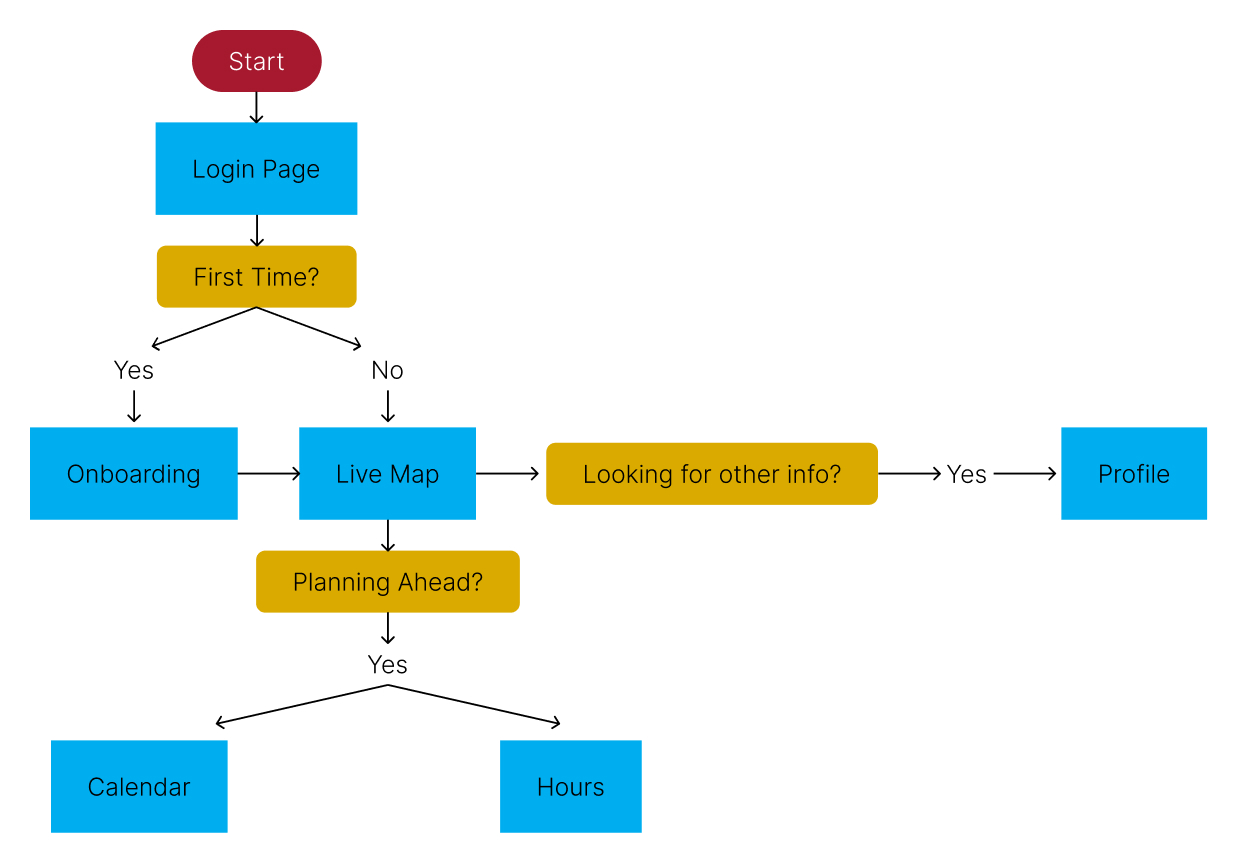
- Here is my document where I defined specific functionality in the app
- I prioritized functionality that would directly address problem statements
- This helped me to visualize how a user might travel through the app and determine how screens should connect

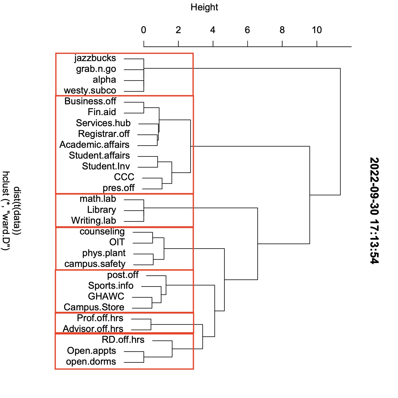
- As a student, there are 30 places or things that students commonly need to know hours for.
- I needed to simplify this content by categorizing into groups and to understand how my users intuitively group the places.
- I had 6 participants in my activity.
- I asked them to sort the cards together by what felt intuitive to them.
- They made as many or as little groups as they felt necessary. In addition, I informed they could also have a unsorted or miscellaneous group if it was needed.
- Lastly, they created names for their groups.
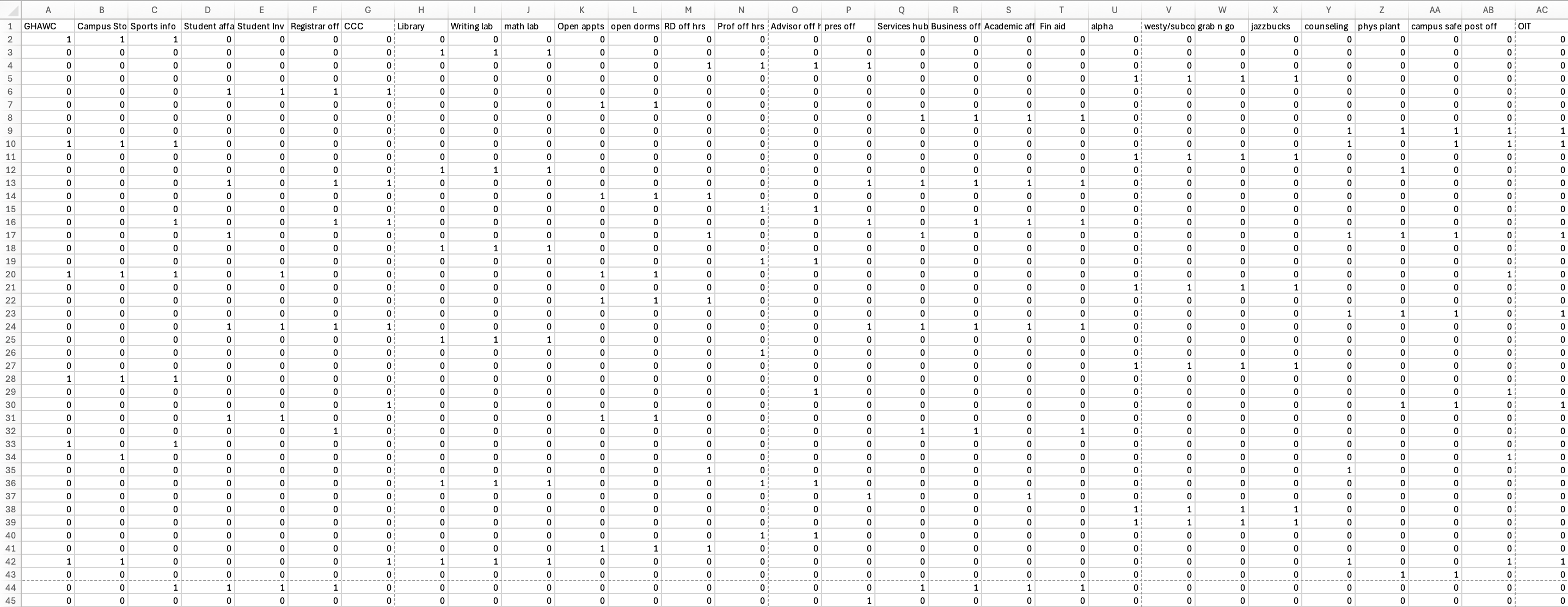
- After this exercise, I input my data into an excel sheet and used a software called, R to form this data set into a dendrogram which showed me the most frequent groupings.
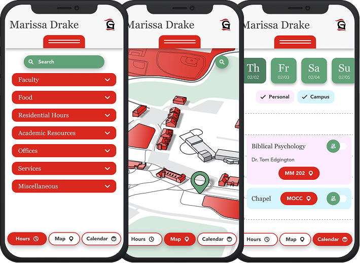
- I followed the Grace College branding.
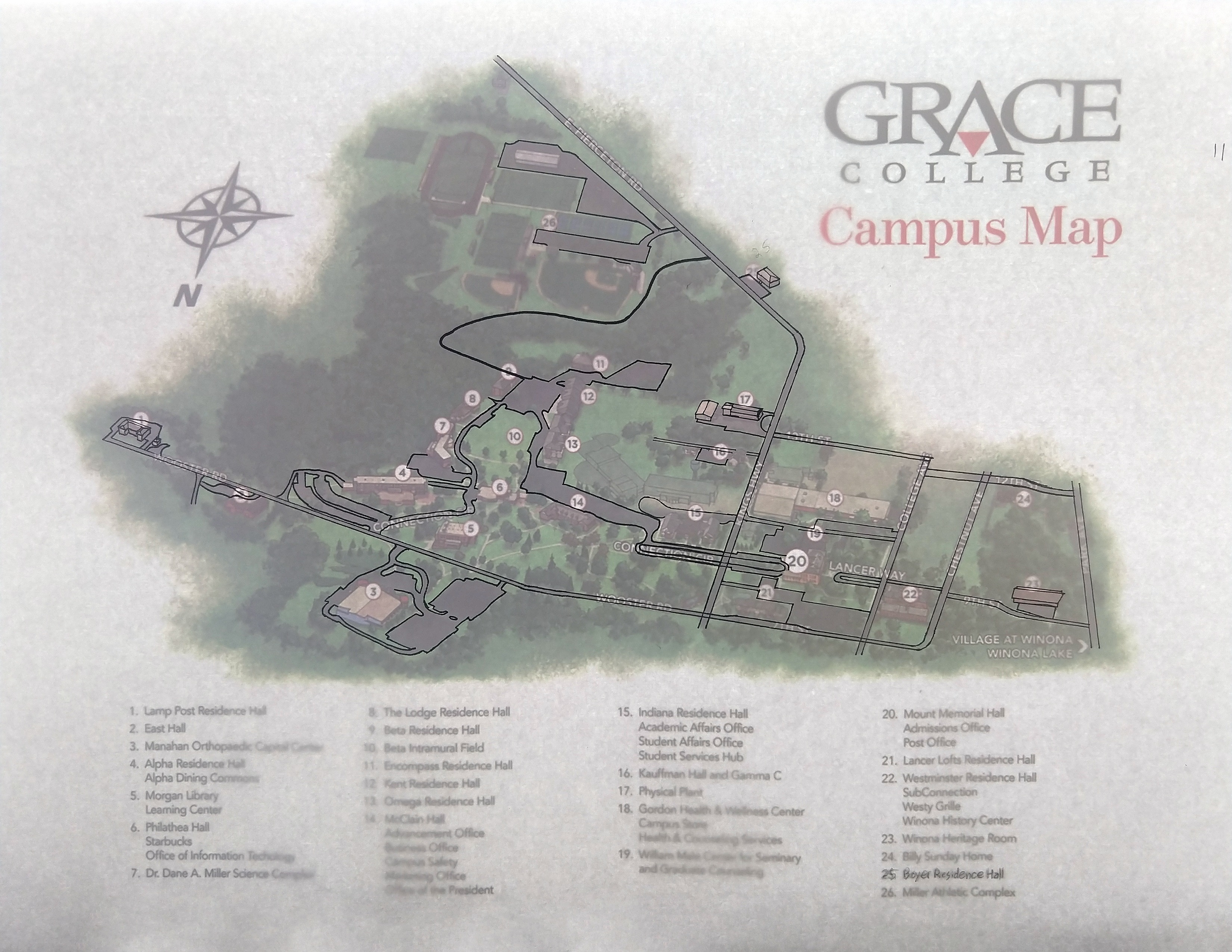
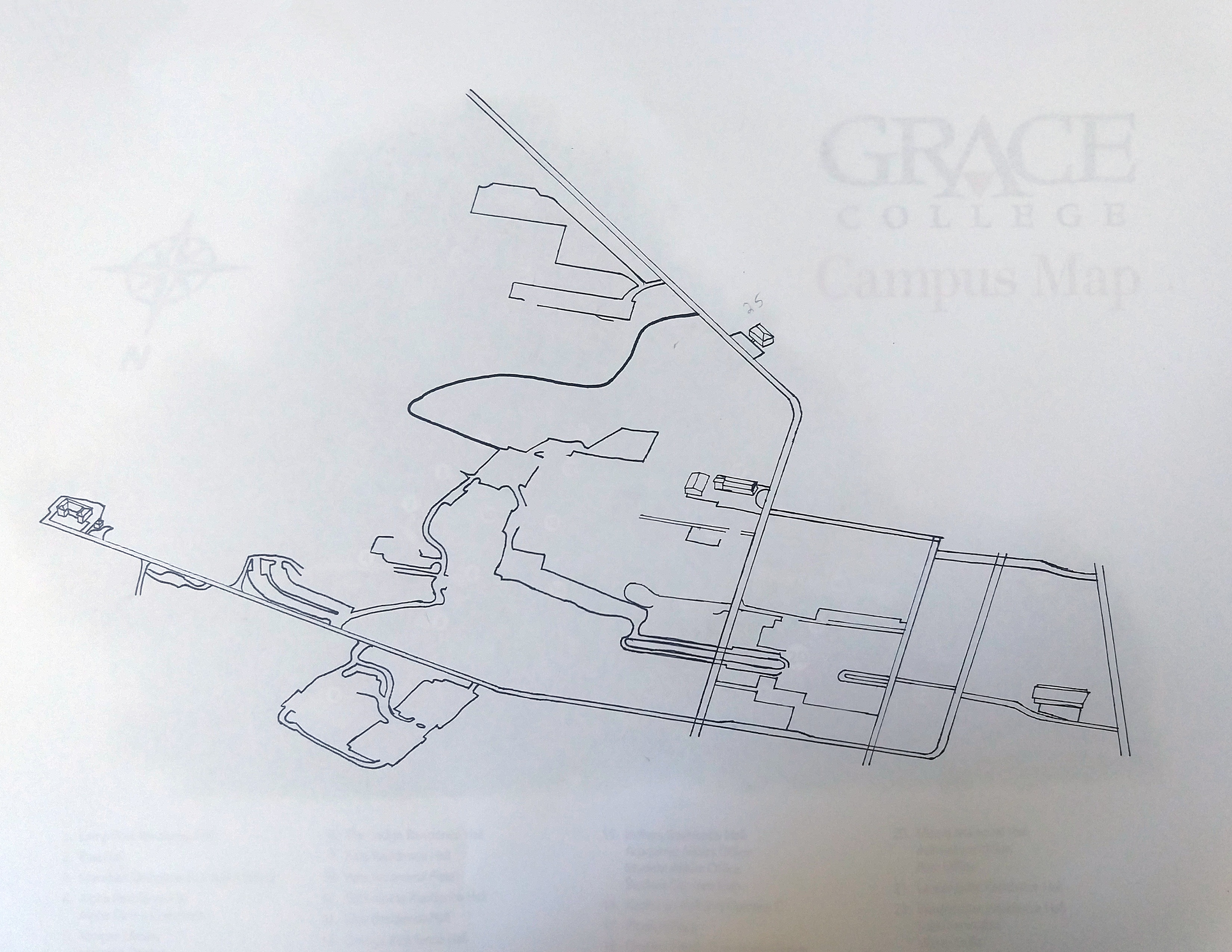
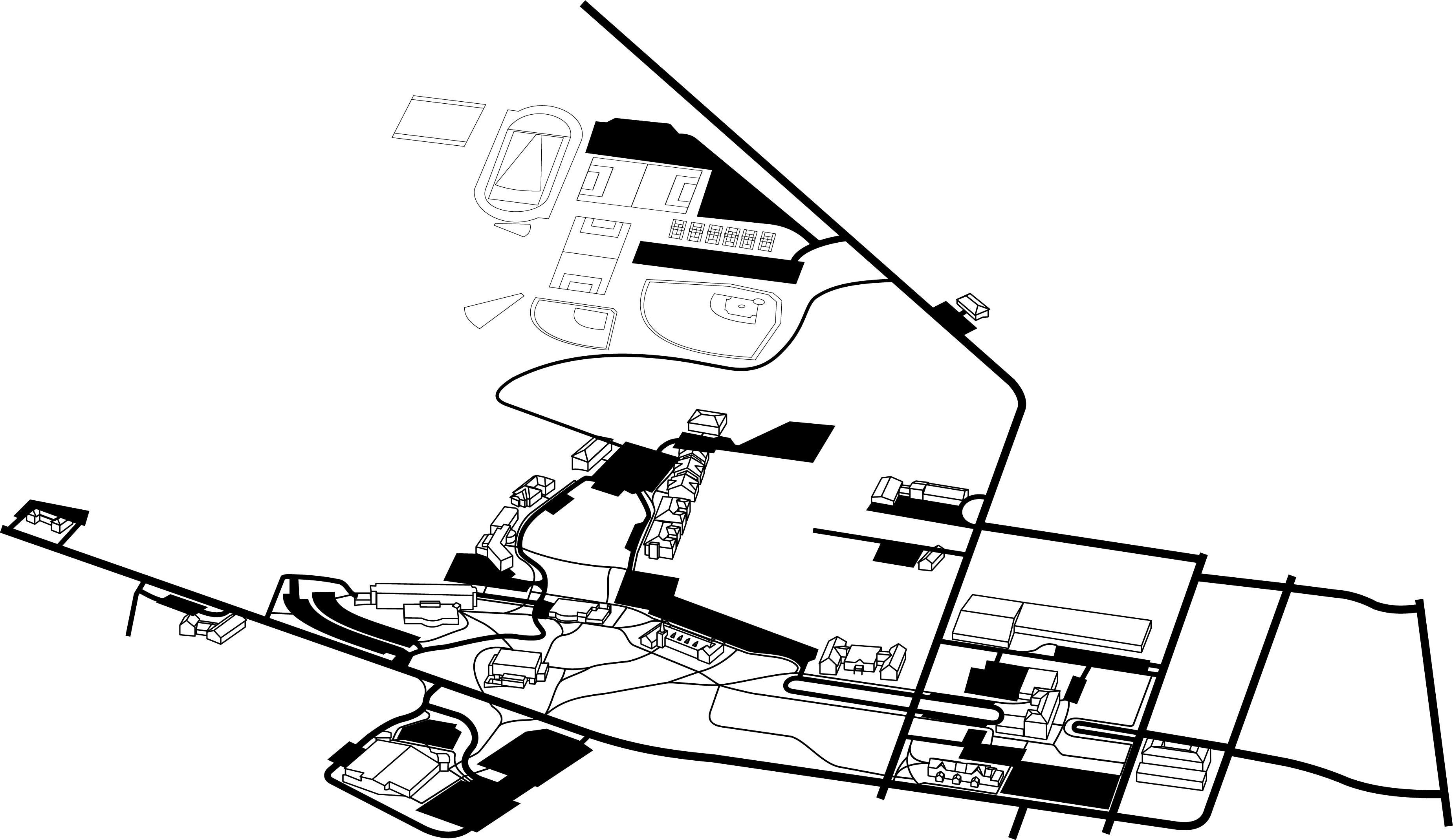
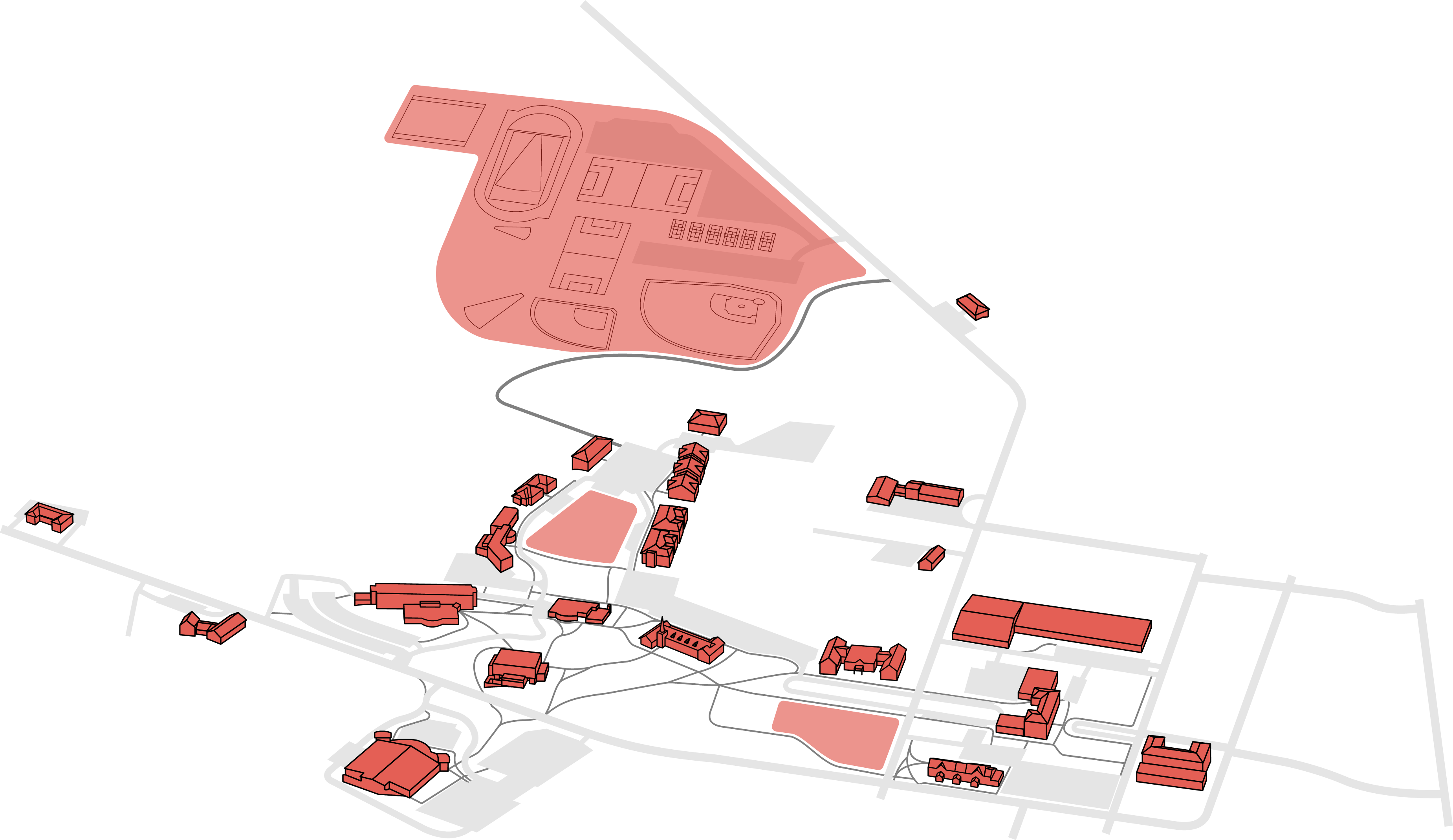
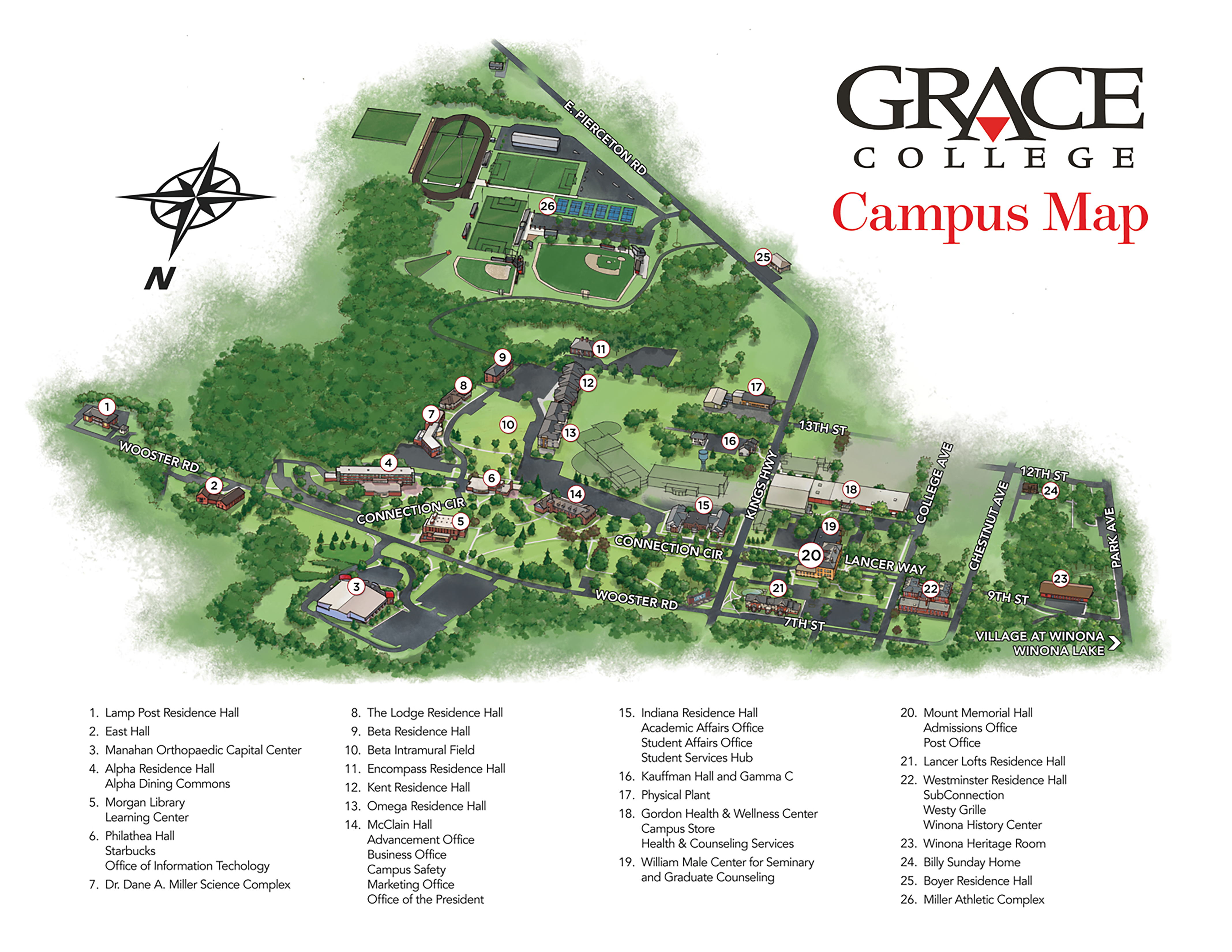
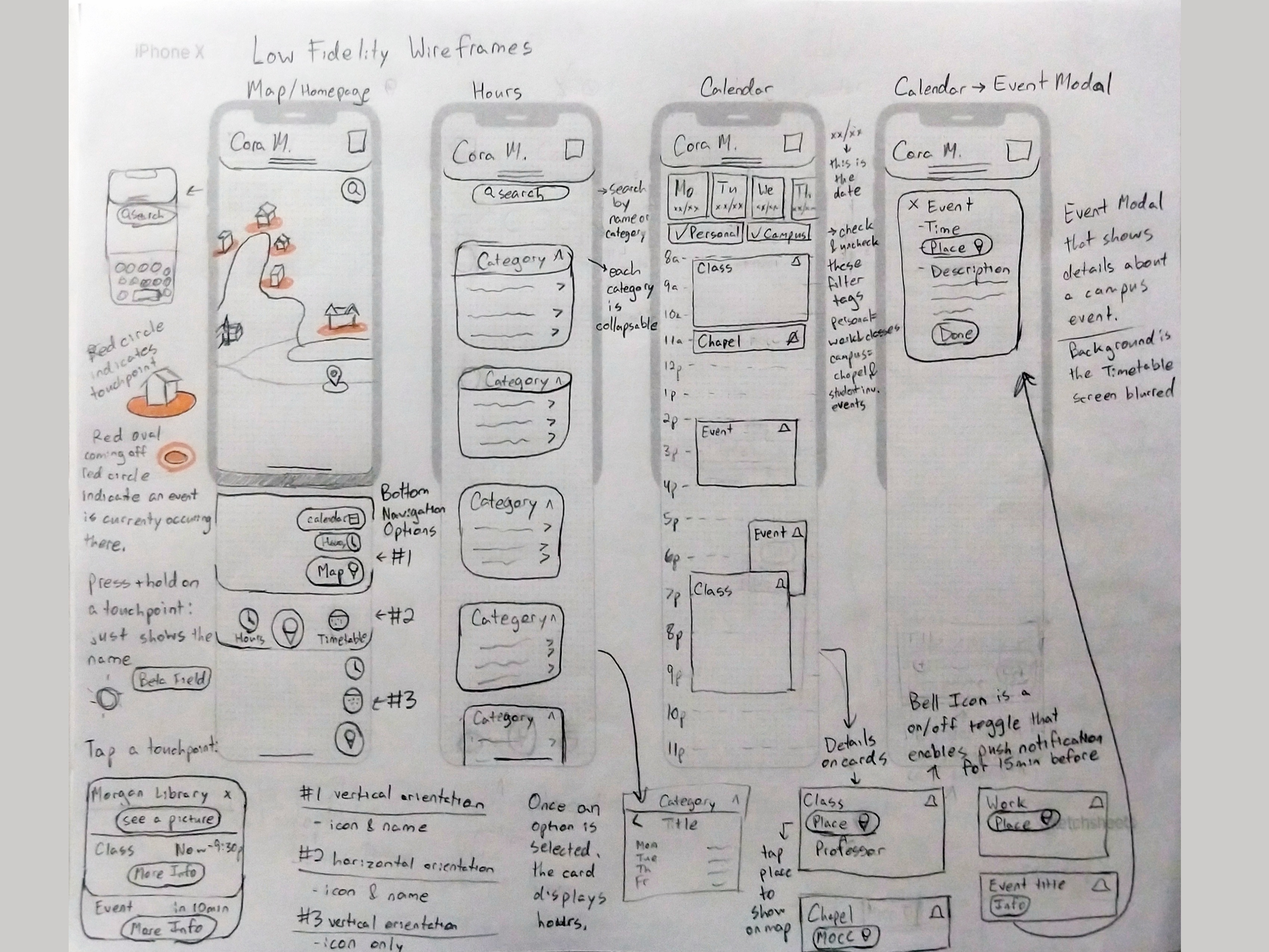
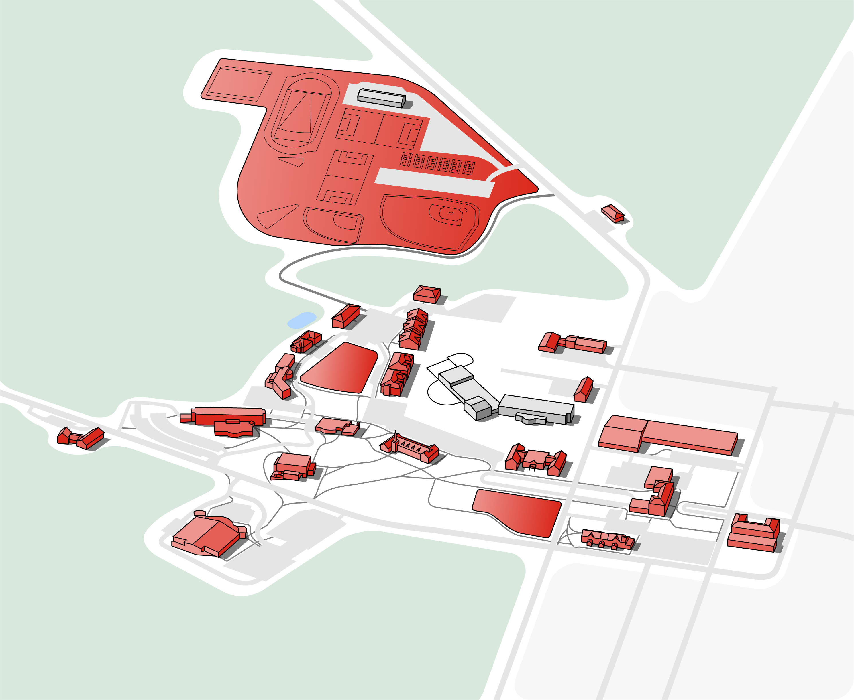
- I used the Grace College Campus map as reference for the live map. The 3D perspective is ideal for recognizing buildings easily, but it needed a redesign to remove unnecessary details and match the look and feel of the rest of the app.
- I found some isometric map designs from Kürsat Ünsal as my stylistic inspiration for the map.
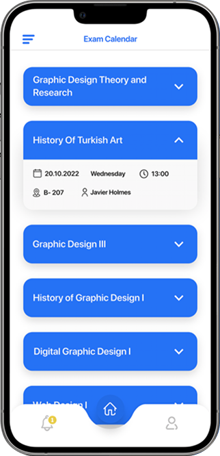
- The Haliç University app concept designed by Can Elmas is my inspiration for the Hours and Calendar sections of the app


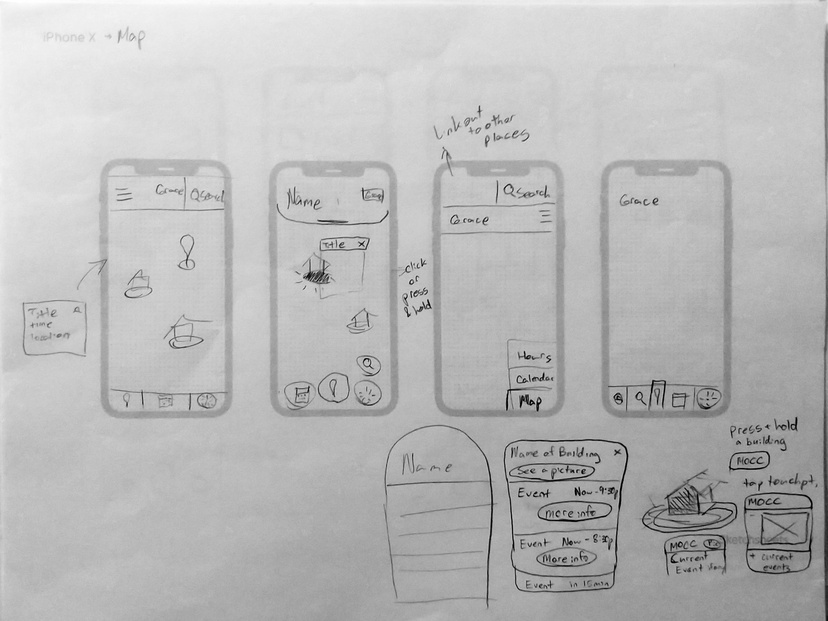
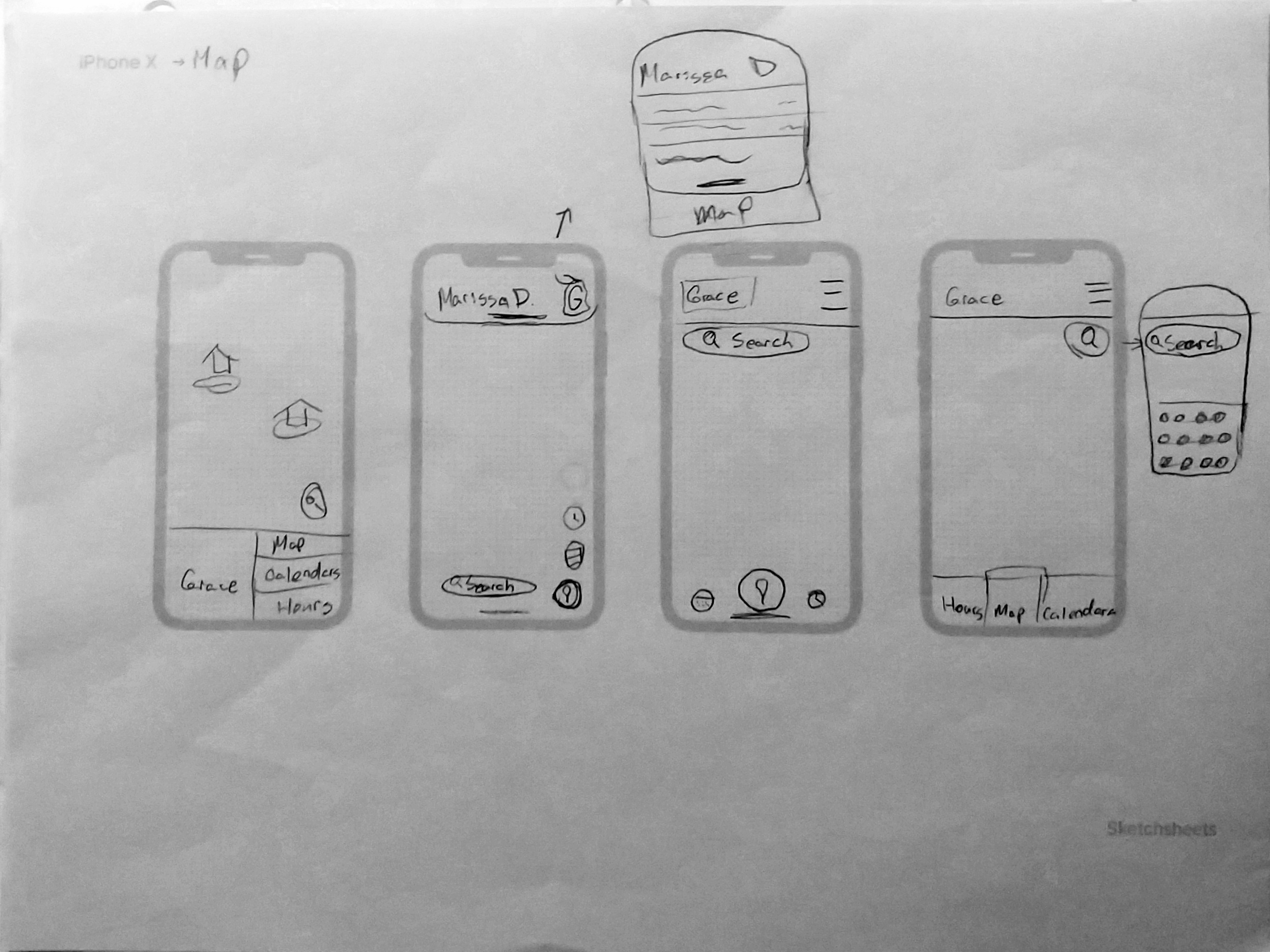
- I conceptualized a variety of different solutions to the various screens I would be designing.
- In order to do this, I set the timer for 8 minutes and gave myself 2 minutes to sketch about 4 each possible solution.
- Here, I finalized my ideas from the design sprint exercise.
- Represented a diverse range of majors and minors
- Freshman through seniors represented
- 4/5 had some involvement on-campus
- 3/5 involved in multiple things
- 3/4 user flows found to be intuitive
- 5/5 participants stated they would use the app daily or every other day
- Participants said they liked how visual the calendar was and that they would rather check the app than read the campus events email
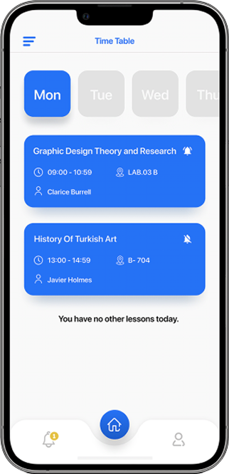
- Participants said they would prefer the horizontal layout over a vertical layout for navigation
- I noticed that, on the hours screen, participants consistently tried to tap on the middle of the category bar to open the dropdown before realizing they must tap the icon.
- Changing navigation layout from vertical to horizontal per usability test findings
- More intuitive touch targets on the hours screen per usability test findings
- Edits to the Map Design
- Update Header
- Updated Color Palette


- Dark mode
- Information about parking and parking lots on campus
- Loading screen has animation of school mascot (lancer) dancing
- Increased involvement on campus
- Assists students, especially first year and transfer students, in finding classes and accessing available service
- Increases accessibility to information that students commonly need access to