Marissa Drake

This tool is for people who want to save money, quickly, for a particular reason. For example, a wedding, big trip, or new car. The users are not new to technology but do not like working with their finances. So, they require that the information they receive via the tool is accessible, and clearly tells them what they can do to better save.
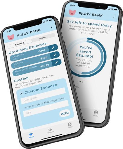
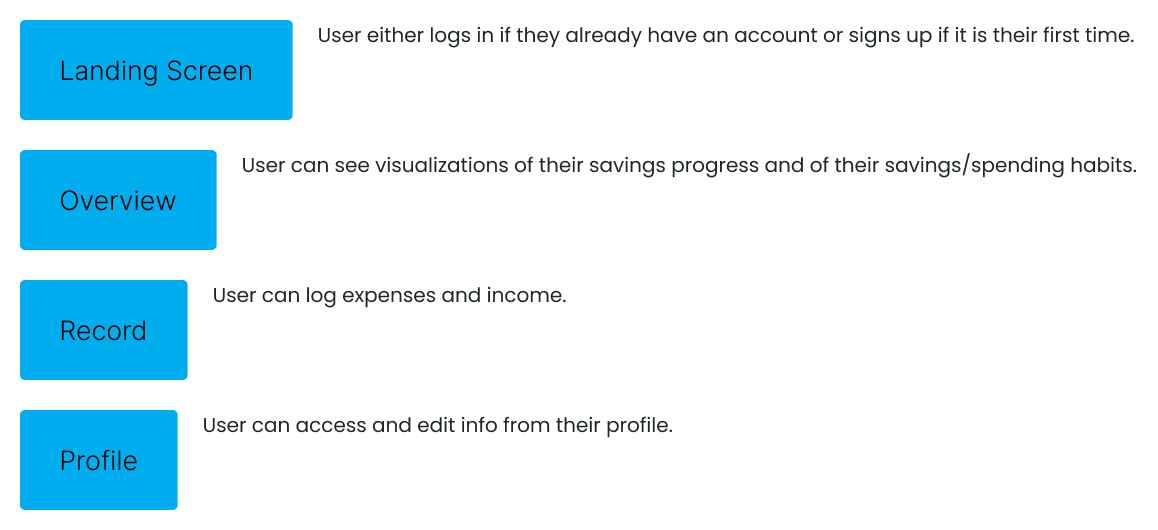
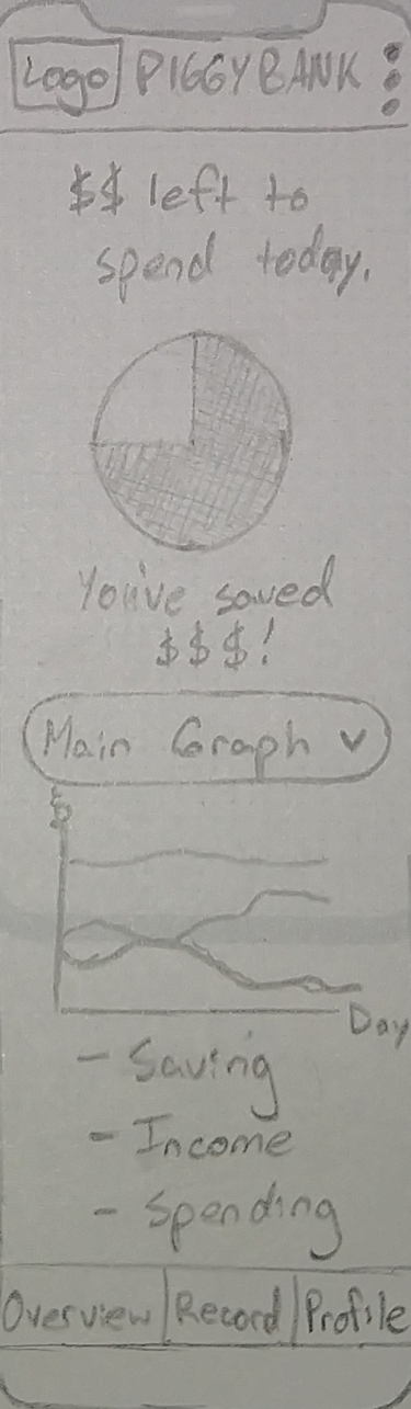
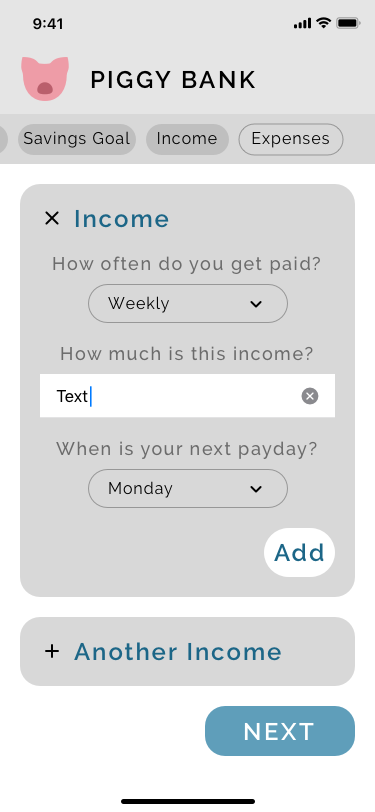
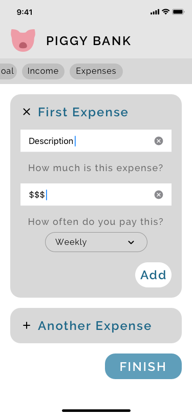
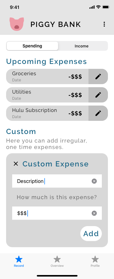
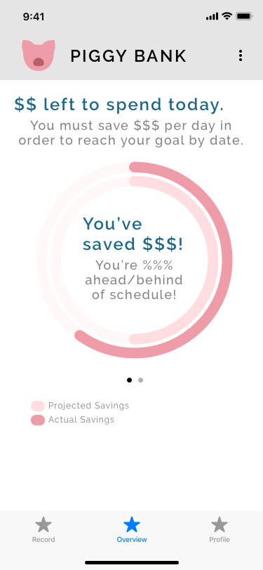
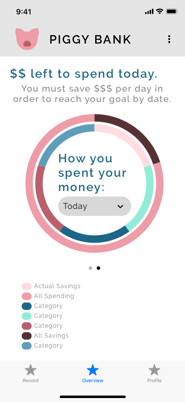
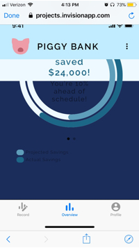
A responsive website, web app, and/or mobile app allowing all data on income and expenses to be recorded easily, on the go, and from a variety of devices. The tool displays data on the user’s finances (how much money they spend and on what), and tells them what they can do to cut costs and save money in a certain amount of time.
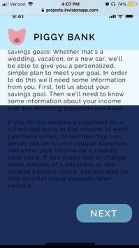
Users will utilize the tool in the period before a planned expense. During this period, they will input data when spending and receiving money so they can view accurate information on their finances and dynamic information on what they can do to save more money.
The tool can be used from anywhere and using any device to ensure income and outgoings are easily recorded.
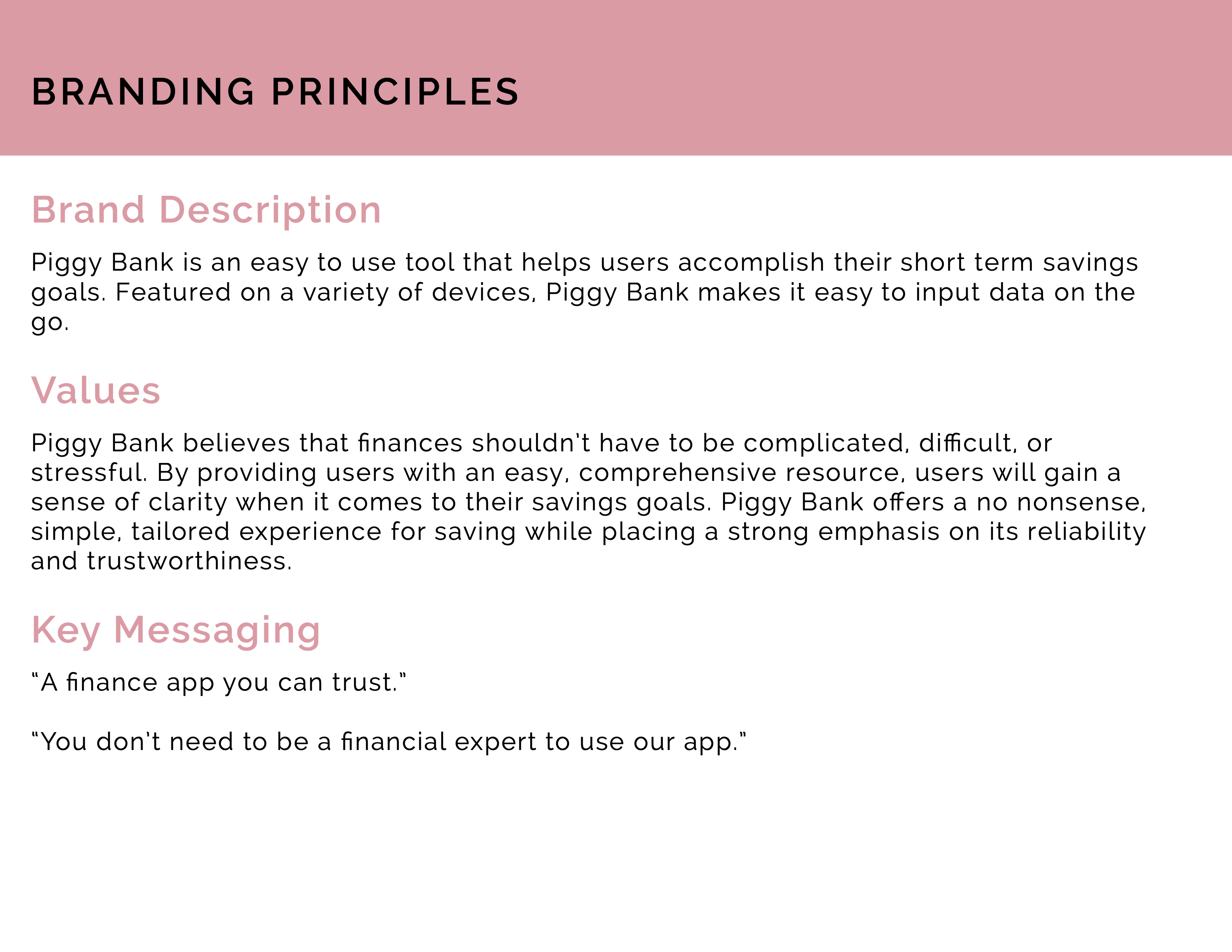
Saving money can be really hard, especially when you don’t have a long time to do so. By providing personalized information on how a user can save based on their actual finances, the tool itself can provide financial advice during these finite periods of saving.
After conducting several informal interviews with friends and family, I wrote these user stories based on their needs.


3 participants

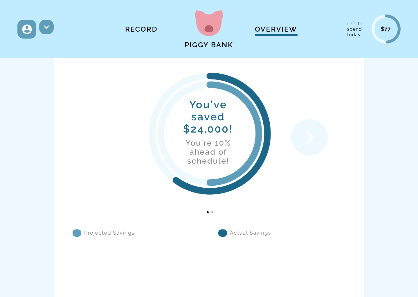
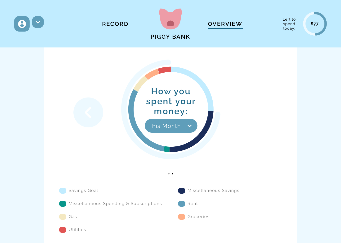
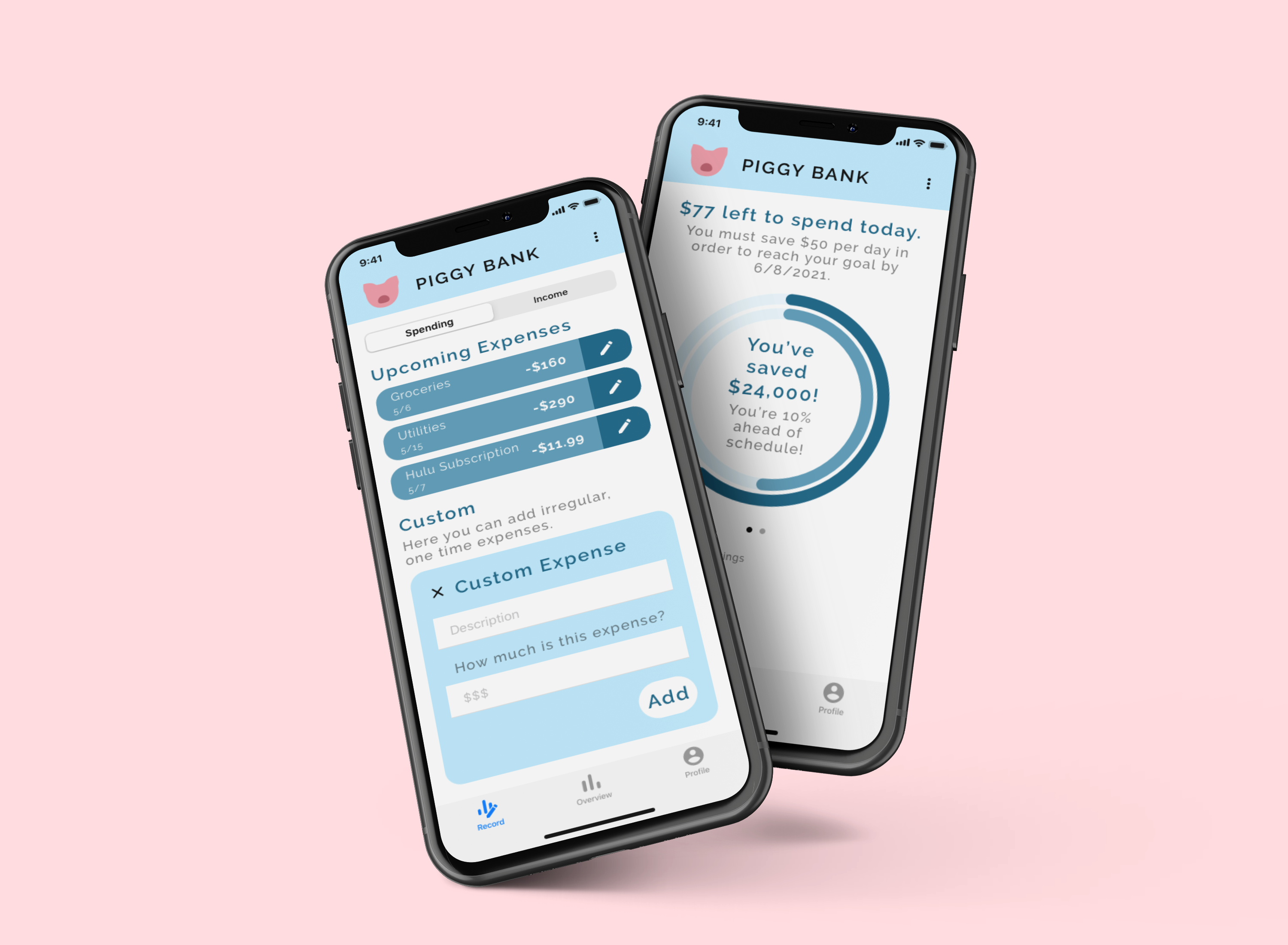
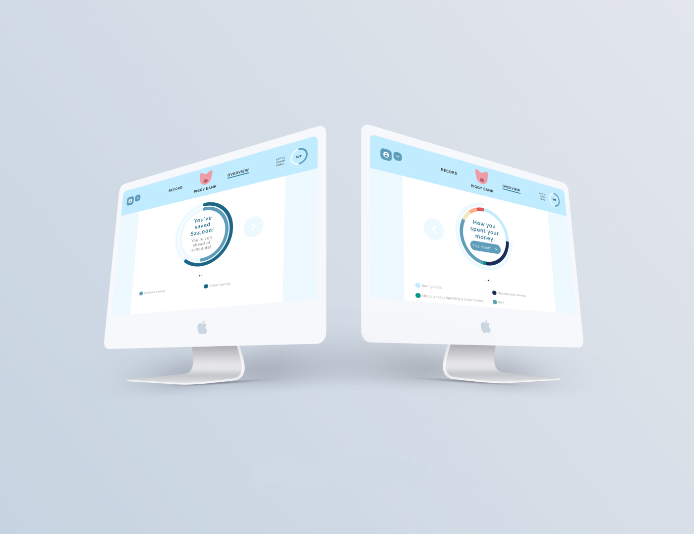
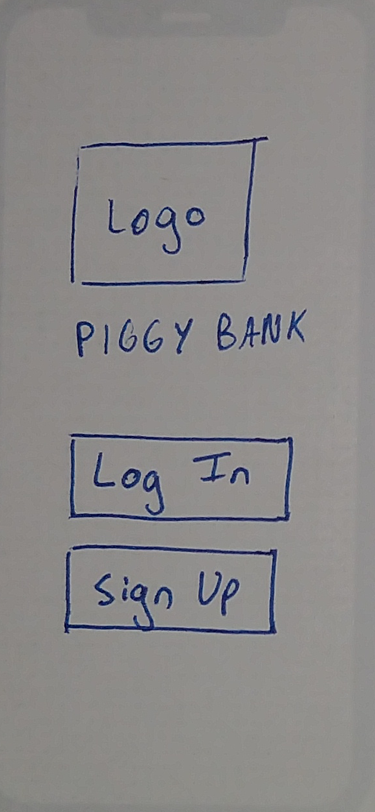
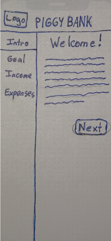
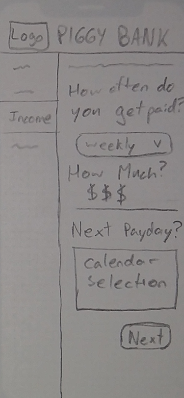
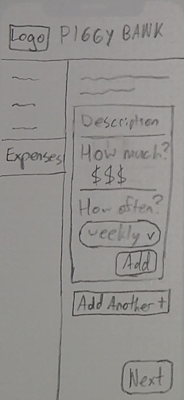
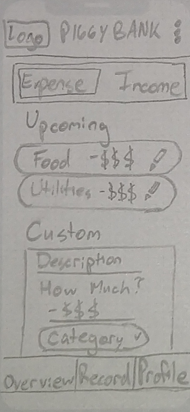
Here are a couple screens that showcase the desktop versions of my app.